
An estimate of variability is the most important input into a risk model. Risk arises because the actual variable values differ from the expected value. This is why the first question you need to ask yourself in order to estimate risk is: How much can the variables be expected to differ from the expected value?
If you do not expect a variable to differ it is deterministic – its value is a known figure. Very few variables are completely known, however I believe in modelling risk on few, but important variables. Hence, variables that do not have a big impact may be treated as deterministic, even though they are not.
Volatility can be estimated in many ways, among them are
- Calculated based on historical time series
- Implicit volatility, when there are market prices for volatility (like for power prices or currency rates)
- Estimated volatility based on your own assessments about future volatility, when there are no market prices available
The input we get from any of these methods are used to define probability distributions, which can be done in several ways also.
- Standard deviation
or the average deviation from the mean ((To be precise: the square root of variance)). If you can use a normal distribution the standard deviation describes the risk. However, the world is rarely normally distributed – and the normal distribution shouldn’t be used frequently.
- High, low and expected value
to set the expected value, a high and a low value defines a probability distribution. I am a believer in simplification, so I use only a few types of curves. There are a large number of different possible distributions, but in reality you only need a few which in most cases give you are model which is more than good enough.
- Fit to historical data
You can use historical data to estimate a probability distribution. There is a function for this in for instance Excel @Risk. It has a large number of possible distributions and calculates which one is best suited based on the data. The problem with a lot of them is that they are complex and difficult to understand and not the least it is difficult to maintain data for them ((Special parameters are needed to calculate the curve, mostly a long line of more or less understandable Greek letters)). I usually avoid these special curves, unless they are the only ones which will describe a variable in a good way, for instance if you need a very long tailed curve.
I often use triangular curves in my modelling or a curve called Pert which is similar to a triangular distribution ((The PERT distribution (meaning Program Evaluation and Review Technique) is rather like a Triangular distribution, in that it has the same set of three parameters. Technically it is a special case of a scaled Beta (or BetaGeneral) distribution. In this sense it can be used as a pragmatic and readily understandable distribution. It can generally be considered as superior to the Triangular distribution when the parameters result in a skewed distribution, as the smooth shape of the curve places less emphasis in the direction of skew)). It can either be set based on minimum/maximum values or on given probability levels. Unless the tails are very skewed it works very well. Leading to the next question you need to ask:
How does the distribution look?
This is a very important point – it is necessary to understand the shape of the curve. Since the world rarely is normally distributed most distributions have a skew in one direction or the other. This is estimated by a statistical figure called skewness, which calculates how large a skew the curve has and in what direction.
Fortunately this is not a number you need to calculate by hand, there are simple and inexpensive statistics programs which can do this for us. I use Stat Tools from Palisade, but you can even calculate on data series using only Excel and the function (SKEW). The important thing is to understand what skew means to risk.
If a distribution has equal tails to the right and the left skewness=0. A skewness <0 means that the distribution has a longer or fatter tail to the left. Skewness >0 gives a tail which is longer or fatter to the right. To sum up:
- =0 Normal
<0 Skew left
>0 Skew right
The chart below shows a normal distribution with an overlay of distributions with a skew to the right or to the left.
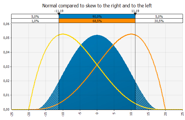
The distributions have the same max and min (-20, +20) but a different expected value (0, -10, +10). The distribution with a tail to the left has skewness of -0, 5 and the one with the tail to the right has a skewness of 0, 5.
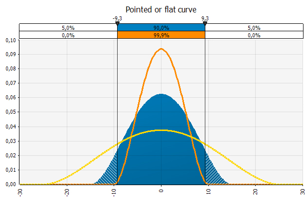
In addition to looking at skewness you should look at the distribution and observe how pointed or flat it is. If the distribution is pointed it means that the observations fall within a smaller range than if it is flat. A good risk rule of thumb is that the flatter the curve, the more risk.
Modeling the spot power price at Nordpool
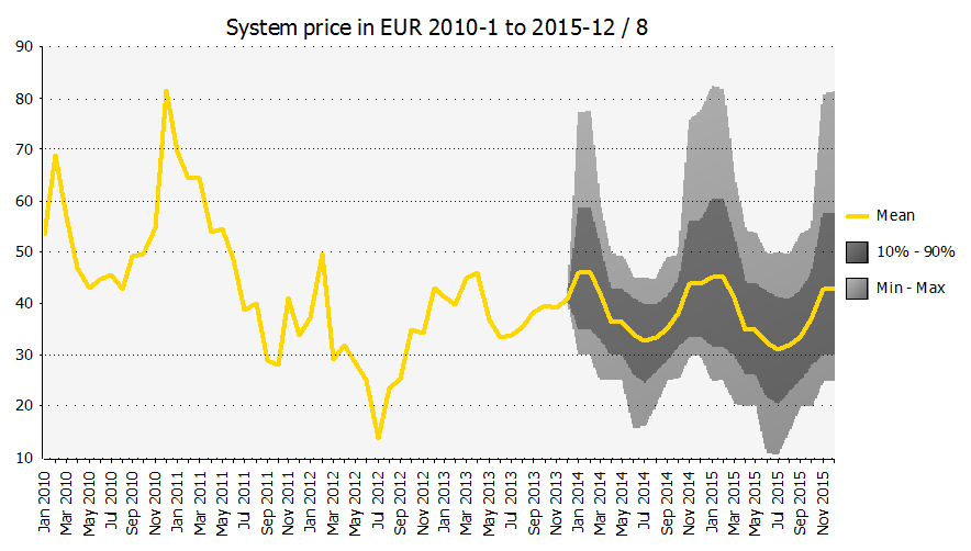
I have downloaded spot prices for power at Nordpool 2010-2013 to show how a probability distribution for the power price may be modeled.
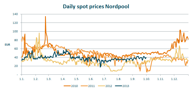
I have calculated a few interesting key figures based on the historical data from Nordpool – you can see them in a table at the bottom of the article. I have calculated figures on daily prices and on average prices for weeks and months. Naturally the variability is greatest on the daily observations. Any averaging will smooth out extreme observations. When I average 7 daily observations into 1 week, I have smoothed the curve. Whether the extreme observations from day to day is a problem is something which needs to be assessed.
- If you are a trader who has done trades which are recognized in P&L daily, you’ll want to consider the extreme daily observations.
- If you are concerned with the end rates for each quarter you will look at the actual rates on these days.
- A production company which is not concerned about the extreme observations from day to day, but rather whether it over time has a power cost which enables it to produce profitable products, may look at weekly or monthly averages.
The next question to consider is whether you should emphasize near history more than remote, or put differently – more emphasis on 2013 than 2010. In this case it is especially important, as the volatility in 2010 was substantially higher than it was in 2012.
In addition it is important to have a view on the average level. It was EUR 22 higher in 2010 than it was in 2012. The fortunate thing about the market for power is that there is a liquid hedging market. At Nasdaq OMX commodities you can get the price for hedging future power cost at any given time. In addition you can get implicit volatility, as there are option prices where the expected volatility is priced. That makes this market much easier to model than for instance the newsprint price, where you neither have a liquid hedging market nor implicit volatility available.
It is also important to remember that variability can be expected to increase with time, and hence volatility should be time weighted.
I make the following assumptions:
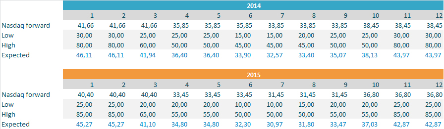
- Nasdaq OMX market price for 2014 and 2015, closing prices 21/10/2013. I use quarterly prices even though I should probably put a profile on the months in the quarter.
- A distribution that allows for extreme outcomes. I use a distribution in which a max and a min value are set, and then it is important that they are not set too conservatively. For 2015 I add EUR 5 on each side to account for uncertainty increasing with time.
- A skew of about 0, 5 in the winter months, since it is likely that the distribution will have a longer and/or fatter tail to the right (higher prices). For the rest of the year I use low to somewhat negative skew. Summer prices have been substantially lower than the current expectation priced in at Nasdaq OMX.
- I cannot fully use data for 2013, as only the months January through September are finished and thus data is available.
Based on my assumptions I get the following distribution definitions:
I use the actual prices for 2010-2012 to assess whether the price estimates given by the distributions are reasonable:
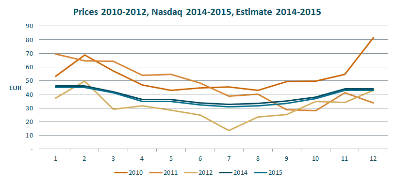
As the chart shows the estimates are low compared to actual prices in 2010 and 2011, but higher than prices in 2012 which was a year with historically low prices. The outcome range is big, however, and that is what should be expected from power prices. They are very volatile. I have included actual 2010-2013 in the chart below as reference.
I plot the historical data with the estimates because it gives a “reality check” on the modelling. In this case I can see that I have modelled the distribution close to the actual historical figures. Other times a different development is expected and that should be reflected in the distributions used. But it is always useful to look at an estimate in the context of developments in the past.
This is a simplified modelling of the volatility in power prices. It might be too simplistic, but as a rule I am for simplifying rather than complicating. Also, this is a modelling of one variable, meaning that it is not necessary to consider and model correlations. As soon as you have more than one variable correlations need to be considered, see this article.
I believe in simplifying models for the future. It gives better control of the modelled uncertainty. Remember that there are always many factors a model does not account for. The main thing is to make a model which gives a good understanding of what creates risk for the business, where you understand what happens in the model and the results it gives. Do not create a big model which becomes a black box no one, not even you, understands.
Data used in this article:
| Period | 2010 | 2011 | 2012 | 2013 | |
|---|---|---|---|---|---|
| Daily prisces | Mean | 53,06 | 47,05 | 31,19 | 38,85 |
| Standard deviation | 13,75 | 15,11 | 11,54 | 6,07 | |
| Coefficient of variance | 26 % | 32 % | 37 % | 16 % | |
| Skewness | 1,81 | -0,19 | 1,40 | 0,62 | |
| Max | 134,80 | 87,43 | 96,15 | 58,54 | |
| Min | 20,67 | 5,79 | 7,85 | 17,48 | |
| Average week | Mean | 52,98 | 47,43 | 31,20 | 38,77 |
| Standard deviation | 12,71 | 15,17 | 10,56 | 5,31 | |
| Coefficient of variance | 24 % | 32 % | 34 % | 14 % | |
| Skewness | 1,58 | -0,02 | 0,69 | 0,69 | |
| Max | 91,38 | 79,81 | 65,71 | 52,36 | |
| Min | 37,86 | 9,99 | 8,91 | 27,96 | |
| Average month | Mean | 53,14 | 47,15 | 31,32 | 38,86 |
| Standard deviation | 11,61 | 14,24 | 9,44 | 4,52 | |
| Coefficient of variance | 22 % | 30 % | 30 % | 12 % | |
| Skewness | 1,65 | 0,21 | 0,20 | 0,42 | |
| Max | 81,65 | 69,62 | 49,59 | 45,91 | |
| Min | 42,89 | 27,95 | 13,70 | 33,46 | |
